Shaun Hill Photography
Logo Design
Visual Identity Design
"Working with Andrew was rad. I love my logo more and more ever since he showed it to me, which doesn’t happen often. It makes me genuinely excited to text my website over to a new client. That feeling is incredible."
Shaun Hill
Shaun Hill Photography is a personal brand built around capturing honest, grounded moments. As the business continued to grow, the existing visual presence lacked the clarity and consistency needed to reflect the quality of the work, creating an opportunity to establish a more intentional identity.
The goal of this project was to create a visual system that could support the photography without competing for attention. Rather than introducing unnecessary complexity, the direction focused on restraint, using a minimal, neutral-first palette and refined typography to keep the work front and center.
Subtle details within the logo and layout system introduce personality without overwhelming the imagery, allowing the identity to feel distinct while remaining adaptable across key touchpoints.
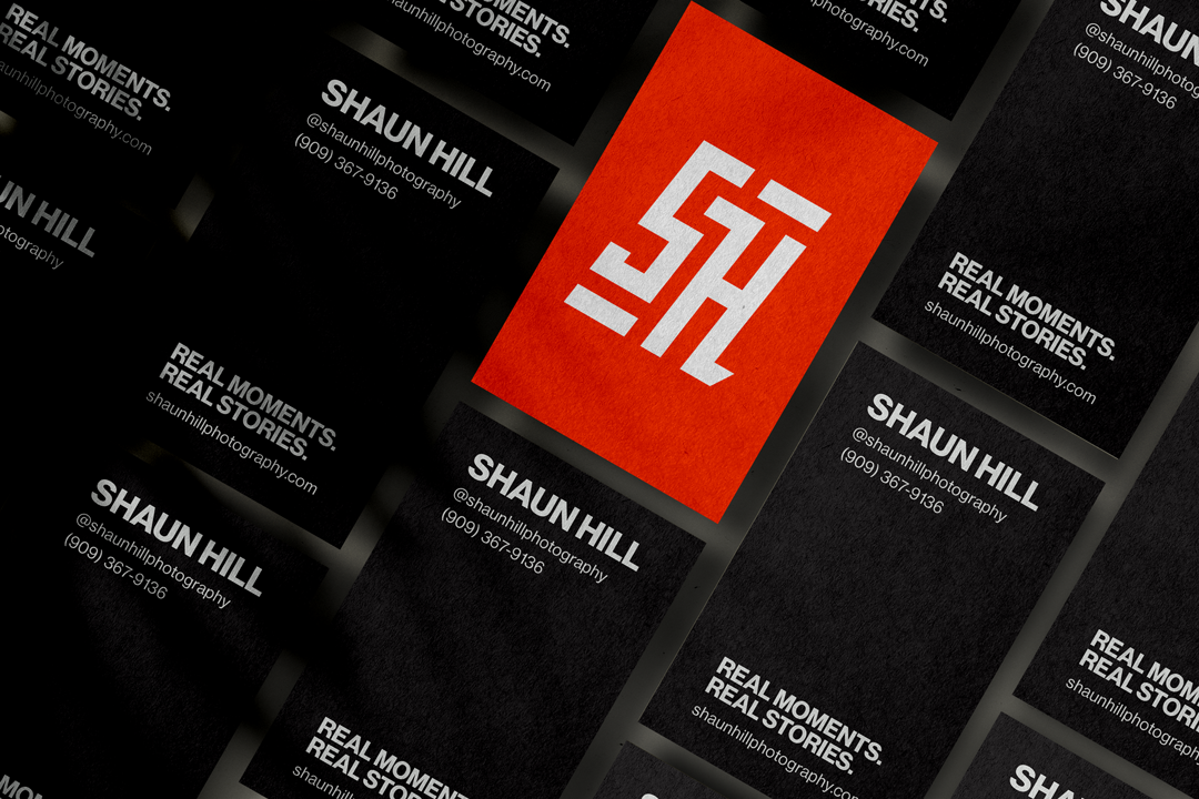
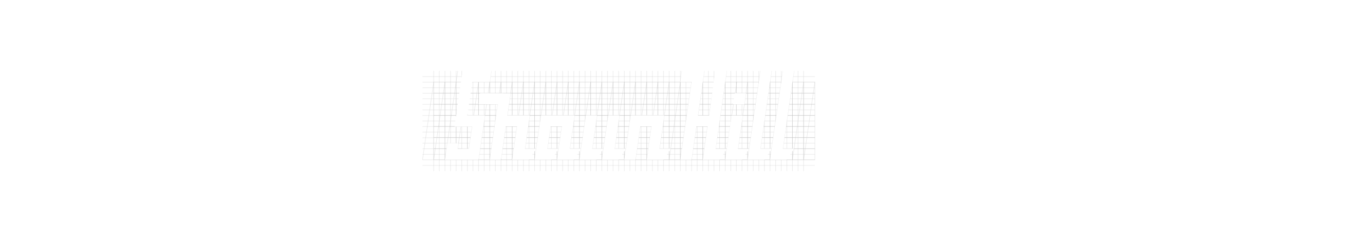
Logo System
The logo system is designed to feel confident and grounded, using refined typography and subtle detailing to create a mark that stands on its own without overpowering the work it supports.


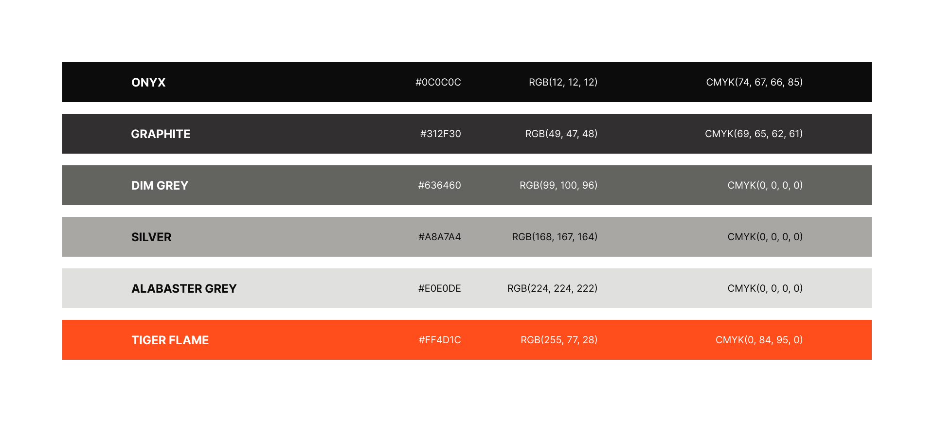
Color System
The color system was built to support the work first, using a neutral palette for the majority of applications to keep the focus on the photography, while a vibrant orange accent is used selectively to introduce energy and create moments of distinction where the brand needs to stand on its own.
Typography
Like colors, for typography, Shaun Hill Photography needed a typeface that could stand beside his work and compliment it instead of clashing. We want to show a little bit of personality without being flashy. For this, we landed on a modern Sans-Serif that is clean, professional, with some character.